Insights
Designing without slop: the rules I gave my AI
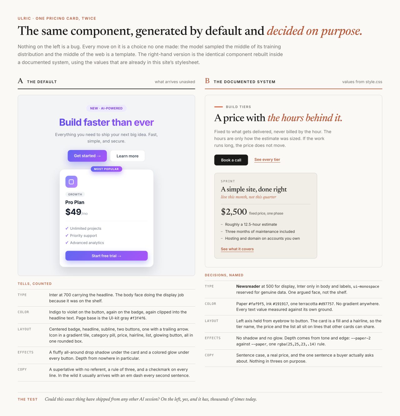
Ask a model for a landing page and you can call the result before it renders. A pill badge over the headline, a blue-to-purple gradient, Inter set large, two buttons with an arrow on the primary one, three pricing cards with the middle one glowing. None of it is wrong on its own. All of it arrived without anyone choosing it.
In July I wrote about the files that keep AI slop out of my projects. That post was about process: which files exist, when they load, what has to happen before anything ships. This one is about the design itself. Type, color, layout, motion, and the copy that sits inside them, with the actual values from the system that runs this site.

What does the default actually look like?
It has a shape specific enough to write down, which is the only reason a law against it can exist.
Type. Inter promoted from a body face to a display face. Space Grotesk, Sora, Syne, Figtree. Fraunces, Cormorant or Playfair the moment a brief contains the word editorial. A monospace face used as the house voice on every eyebrow, caption and colophon, when mono belongs to genuine data and nothing else.
Color. Purple, and the blue-to-purple gradient above everything. The cool blue-charcoal dark theme, slate-indigo ink around #0c0e15 with a periwinkle accent. The UI-kit gray #f3f4f6 as a footer band or a card fill, which is a non-decision wearing the costume of restraint. Gradient clipped into headline text.
Layout. The centered stack: eyebrow pill, headline, subline, gradient button with a trailing arrow, ghost button beside it. The kitchen-sink card, where an icon tile, a category pill, tag pills, a hairline, a price and a glowing button all live in one rounded box. Three pricing tiers with the middle one lit. A testimonial from an invented VP whose velocity jumped 32 percent. A fake macOS window with traffic-light dots, running code against an SDK that does not exist.
Effects. A glow under everything. The fluffy all-around drop shadow, depth from no light source in particular. The card hover-lift, the button that boops, glass that bands and smears where no blur at all would have been better.
Copy. Em dashes at a rate no human sustains. Emoji bullets. The contrast scaffold, "it is not just X, it is Y." A vocabulary you can recite from memory: seamless, elevate, unlock, delve, robust, leverage, empower, game-changer, effortless. Everything in threes.
I have no census of AI-generated pages, and I have not found one published that would survive scrutiny, so treat that list as a field note rather than a finding. What I can say is that it stopped growing much after the first month of keeping it, which is its own kind of evidence.
Why do the models converge on the same look?
Two mechanisms, and they stack.
The first is the training distribution. A model samples toward the middle of what it has seen, and the middle of the web is a template. Donghoon Shin and colleagues at the University of Washington and Microsoft Research put it plainly in a March 2026 paper on web vibe coding: generative AI "is known for its tendency to homogenize, often reproducing dominant style conventions found in training data." Their contribution is showing that this holds for structural work, not just for images and prose, and that the fastest interaction pattern is the worst one for diversity. When generation is designed to feel frictionless, they write, "it relies heavily on the model's probabilistic defaults to fill in the gaps of a user's intent," and users accept the first plausible output.
The second is preference tuning, and it is the part I find more interesting. Alignment makes models likable, and likable means familiar. Jiayi Zhang and co-authors traced this to the annotation data itself in a paper on mode collapse first posted in October 2025 and revised in July 2026:
Unlike prior work that attributes this effect to algorithmic limitations, we identify a fundamental, pervasive data-level driver: typicality bias in preference data, whereby annotators systematically favor familiar text as a result of well-established findings in cognitive psychology.
Read that next to what a design brief usually asks for. "Make it look premium" is a request for the most typical premium thing, and the model obliges. The glow under the button is not the model failing. It is the model succeeding at the objective it was actually trained on.
The cost lands on everyone at once rather than on any individual. Anil Doshi at UCL and Oliver Hauser at Exeter ran a controlled experiment on short-story writing, 500 people recruited and 293 analyzed, published in Science Advances on 12 July 2024. The AI-assisted stories were rated more creative, and similarity between stories rose by an amount equal to 10.7 percent of the observed range in the AI-free group. Their own sentence is the careful one: in the human-only condition the similarity scores "span a range of 8.10 points; therefore, the increase in similarity from having access to one or five generative AI ideas represents 10.7% and 8.9% of the total range, respectively." Ten point seven is the one-idea condition, and it is a share of a range, not a percentage rise in similarity, which is worth getting right because the second reading is both punchier and wrong. That is prose, not layout, and I am not going to stretch it into a claim about design. It does describe the trade cleanly: each person gets a better-than-baseline result, and the pool of work gets narrower.
Does prompting harder fix it?
No, and the reason is dull. Taste does not survive in a prompt. A long session forgets its instructions, a new session never had them, and "make it feel premium, not generic" is the exact instruction that produces the glow under the button.
What works is written law that loads before the work starts, plus something that reads the output afterward. Mine is five markdown files, 2,429 words in total: a compact core that loads on any design or copy task, and four long references (type and color, layout and effects, copy, execution defects) that load only when the work needs them. The stub in this repo dates to 16 July 2026, the same day I published the process post; the full references were written on 30 July. Shin's team calls this class of intervention productive friction, which they define as "interactional interventions that disrupt the automatic acceptance of homogenized AI outputs." I like that phrase because it names the mechanism rather than the mood. The point is not to slow down. The point is to make accepting the first output require a decision.

The type rule: argue the face in one sentence
Every face has to come with a reason, and the reason has to fit in a sentence. "It was on the shelf" is not a reason.
This site sets display type in Newsreader. Its own README describes it as "an original typeface designed by Production Type, primarily intended for continuous on-screen reading in content-rich environments," it was commissioned by Google Fonts, and it was shortlisted at D&AD in 2021 for type design. It ships with real optical sizes, so the same family can carry a 5.4rem headline and a 1.35rem pull quote without either looking like the other one stretched. Its italic has enough voice to carry the terracotta clause that ends most headlines here. That is the sentence.
The standard for what "argued" means comes from working foundries. Kris Sowersby of Klim publishes a long design-notes essay for every release; the one for Die Grotesk, from January 2025, opens "Die Grotesk was shaped in the long shadow of Helvetica, a typeface revered and resented in equal measure." That is a designer naming the problem his face exists to solve, which is the opposite of a font picked because it was near the top of a list.
The rest of the rule is short. Inter is allowed in body and labels, never as the thing carrying a brand. And no display face or headline-plus-body pairing gets reused across two of the studio's projects, because a house pairing repeated across briefs is itself a tell.
--display: 'Newsreader', Georgia, serif;
--body:    'Inter', -apple-system, BlinkMacSystemFont, sans-serif;
--mono:    ui-monospace, 'SF Mono', SFMono-Regular, Menlo, monospace;
The stylesheet carries the reason next to the rule so nobody has to remember it. The comment above the code-block styles reads: "Mono is for genuine data (configs, commands, API shapes), never for voice."
The color rule: a value is not accessible, a pair is
One considered palette, owned by this brand, held across the whole page, and every piece of text clearing its ground by a measured gap rather than a squint.
The palette here is a short list of custom properties. Paper #faf9f5 and a second paper #f0eee6, ink #191917 and a softer #33322e, stone #6f6d66 and a lighter #a3a094 for dark grounds, a terracotta #d97757 with a deeper #b25838, manilla #ebdbbc, kraft #d4a27f, and one hairline at rgba(25,25,23,.14). Gradients do exist in the stylesheet, and every one of them is a scrim, a mask fade, or a two-step tonal fill inside a single hue family: a 3px scroll-progress bar running terracotta to deep terracotta, a manilla-to-kraft field behind an image that has not loaded yet. None fills a button. None is clipped into headline text. Those two places are where the tell actually lives.
Writing this post, I ran all of them against the paper ground with the sRGB relative-luminance formula. WCAG 2.2, a W3C Recommendation as revised on 12 December 2024, sets the bar in success criterion 1.4.3: text needs "a contrast ratio of at least 4.5:1," with large text allowed 3:1. Ink lands at 16.71:1 and ink-soft at 12.18:1, both fine anywhere. Stone comes in at 4.92:1, which is why it can carry a lede and a caption. The light stone reads 2.49:1 on paper, which is why it is never allowed to hold text there, and 6.72:1 on the ink ground, which is where it actually lives. Same hex, two verdicts, decided entirely by what is behind it.

The layout rule: could this be any other product's page?
That question is the whole rule, and it disqualifies more work than any list of banned components does.
The list exists anyway, because a general principle is easy to nod at and hard to enforce. Banned outright: the centered hero stack, the kitchen-sink card, the three-tier pricing block with the glowing middle, the testimonial card with its giant quote glyph and invented job title, the pre-footer CTA slab with "no credit card required" under two buttons, the gradient squircle logo, the icon in a colored tile, the full-bleed graph-paper grid, the countdown timer, the dot under the active nav item.
What replaces them is composition. The hero owns the first screen with no stray half-section peeking in underneath. Parallel columns align on a shared grid, and buttons especially sit on the same line regardless of how long each card's copy ran, which usually means anchoring the call to action to the card bottom and holding empty slots open. Text never touches an edge. Asymmetry is allowed when it is composed, and is not the same thing as flinging content at opposite rims with a dead gulf in the middle.
The motion rule: content is visible by default
One rule outranks every other motion rule I have: never gate the existence of text or a control on an animation firing.
No opacity:0 waiting on an IntersectionObserver that may not fire, no stranded initial state, no scroll-driven reveal without a non-animated fallback. A static page that reads beats a beautiful one that renders blank, and the blank version is exactly what a reader on a throttled connection, an old browser, or a car's built-in browser gets. The check for this is one line of process: hard-refresh with the animation engine stalled and confirm every section still shows its content.
The rest of the motion law is restraint. Depth is one tight directional shadow from a single light source, or better, tone and edge with no shadow at all. Hover changes cleanly: a fill shift, a tonal step, never a lift with a blooming shadow. Half-built motion, stuttering easing, caps that flip from sharp to rounded mid-animation, all of it reads worse than no motion, so it gets cut or finished. My own solid button still carries a translateY(-1px) on hover, which is the boop in miniature, and it is on the list.
This is where my previous career shows up in the code. I spent a decade in mental health, most recently as a licensed professional counselor, in residential treatment, jail settings and crisis work, before I closed the practice in 2026 to build full time. Watching for that long what happens to people who are already at capacity changes what you think an interface is allowed to ask for. A page that moves at you is spending attention the reader never offered. Calm is not a style preference here, it is a decision about whose budget gets spent, and the motion rules are mostly that decision written down so an agent cannot quietly reverse it at two in the morning.
Motion earns its place when the reader is driving it, which is the whole argument in the piece on scroll-scrubbed video: the frames advance because a thumb moved, and the page is legible at every frame including the first.
Does a law work if nothing enforces it?
Not on its own, no. A law that only the author remembers is a preference.
So the check is a separate agent. Before any interface or public copy is called done, a forked reviewer runs on its own context, reads the four reference files, reads the actual output (files, URLs, rendered screenshots), and walks the law point by point against what is there rather than what was intended. It is not allowed to fix anything, because a reviewer that edits starts negotiating with itself. It returns a violation list, most severe first, each with the rule quoted and a concrete fix, and one verdict line: SHIP, or FIX FIRST: N violations. Its instructions end with "No praise, no summary of what was checked, no hedging."
It runs on a cheap model, which matters, because a gate you avoid because it is expensive is not a gate. That is the same reasoning behind the hooks that never ask the model and behind the verify step in every production loop I run: the thing that checks the work has to be structurally incapable of being talked out of it.
One clause makes the whole system usable: an established, documented brand system outranks the law, and an explicit human instruction outranks everything. Without it, a law written to protect distinctiveness would flatten every brand it touched into its own house style, which would be the same failure wearing better clothes.
What the arithmetic found in my own stylesheet
The deep terracotta is the link color in every post on this site. .prose a{color:var(--accent-deep)}, set at 1.02rem off a body size that clamps between 15.5px and 17px. When I ran the palette for this post, #c15f3c on #faf9f5 came back at 4.01:1. Normal text by the standard's own definition, so the floor is 4.5:1, and the value was 0.49 short.
The fix is arithmetic, not taste. Holding the hue and walking the lightness down, #b25838 clears it at 4.59:1: the same terracotta, four points darker. That is what shipped, in commit e27d6a5 the same morning I measured it. The token appears 61 times in that stylesheet as of 4 September 2026, so it wanted one careful pass rather than a find-and-replace on a Thursday, and the pass left one thing standing: on the tinted #f0eee6 ground the new value reads 4.16:1, still under the floor. Named here rather than quietly closed.
Which is the part worth keeping. I wrote a rule that says every value clears its ground by a measured gap, applied it to the one part of my own system I trusted most, and it convicted me. A law that has never once ruled against the person who wrote it is not a law. It is decoration with good posture.
Common questions
How do you avoid the AI-generated look?
Name the defaults, then write a rule that replaces each one. The recognizable defaults are Inter or Space Grotesk carrying a headline, a blue-to-purple gradient, the UI-kit gray #f3f4f6, a centered hero over three feature cards, glows and fluffy drop shadows, and copy full of em dashes and stock words. Replacing them means one argued typeface, one measured palette, a composed layout, restrained motion, and a reviewer that reads the finished output before it ships.
Why do AI design tools produce such similar layouts?
Two reasons that compound. A model samples toward the middle of its training distribution, and the middle of the web is a template. Then preference tuning pushes it further: Zhang et al. (arXiv 2510.01171) traced mode collapse to typicality bias in preference data, meaning annotators systematically favor familiar text. Shin et al. (arXiv 2603.13036, March 2026) showed the same homogenizing pull holds for structural work like web design, and that frictionless generation makes it worse.
Which fonts and colors read as AI-generated?
As display faces: Inter, Space Grotesk, Sora, Syne, Archivo, Work Sans, Figtree, plus Fraunces, Cormorant and Playfair when a brief says editorial, and any monospace used as a house voice. As color: purple and blue-to-purple gradients above all, the blue-charcoal dark theme around #0c0e15 with a periwinkle accent, pastel candy washes and blurred gradient blobs, the UI-kit gray #f3f4f6, and gradient clipped into headline text.
What contrast ratio does body text need?
WCAG 2.2 success criterion 1.4.3 requires at least 4.5:1 for normal text and 3:1 for large text, where large means 18pt or 14pt bold. A color has no rating on its own; the ratio belongs to the pair. The light stone in this site's palette reads 2.49:1 on the ivory ground and 6.72:1 on the ink ground, which is why the same hex is banned in one place and correct in the other.
Is it enough to just tell the AI not to make it generic?
No. Taste does not survive in a prompt: a long session forgets its instructions, a new session never had them, and asking for something premium and not generic is the instruction that produces the glow under the button. What works is a written law that loads before the work starts and a separate reviewer that reads the finished output afterward and reports violations without being allowed to fix them.
Related