Insights
The tool bench a one-person studio builds for itself
Ten small tools sit on a bench on my desk machine and not one of them has ever been deployed. They exist because the client work keeps asking for a step that no product quite does: prove a slide will survive a platform's crop before it posts, stage a 3D model for a scroll hero, film a demo that has to come out identical every time it is filmed. Not one of them has a URL, a login screen, or a user other than me. The files they produce are the only part that ships.
When does a manual step become a tool?
The third time.
That rule is already written on the case study for the bench, in one line: "When the same fussy step comes up three times, I build a small tool for it." The third time is the trigger rather than the second, and the difference matters more than it sounds. Twice is a coincidence, and a tool built on two examples is shaped by whichever of the two you remember better. By the third pass you can see which parts of the step were actually the same each time, which is the only part worth encoding.
Slide Proof, the first thing on the bench, came out of exactly that. I had re-derived platform safe zones and brand scrim ramps by hand for a third round of campaign decks, in a graphics editor, from a spec I kept re-reading. The arithmetic was not hard. It was just arithmetic I had done twice already and would get slightly wrong on a Friday.
What is actually on the bench?
Ten browser apps in one folder, plus two recorders and a phone audit that live elsewhere in the same local stack.
The five that carry real weight are a proofing bench for social slides, a 3D scrub builder, a recorder that frames screen captures in browser chrome, a second recorder that films a live page on a frozen clock, and a headless audit that walks a site at phone width and asserts nothing overflows. The other eight browser apps are a design lab, one effect each, all wired to the same brand palettes, and the case study shows every one of them with a screenshot. This post is about the bench as a system, so I am going to take one of the five apart properly and link the rest.
How does the slide proofer compute a safe zone?
From the canvas it is handed, every time, with one function and no stored pictures.
The whole geometry of the tool is 228 lines in a file called proof-spec.ts, and the comment at the top of it is the design:
One source of truth consumed by both the DOM preview overlay and the canvas export renderer so proof and artifact can never drift apart.
getGuideSet(format, width, height) takes the format and the canvas and returns two things: the area copy is allowed to live in, and the bands the platform is going to cover or crop. Here is the Instagram and Facebook feed branch, verbatim:
if (format === "ig-45") {
  // Feed crop previews square: text stays inside the centered square.
  const side = Math.min(width, height);
  const top = (height - side) / 2;
  return {
    dangerZones: [
      { height: top, width, x: 0, y: 0 },
      { height: height - top - side, width, x: 0, y: top + side },
    ],
    safeArea: { height: side, width: side, x: (width - side) / 2, y: top },
  };
}
Give it a 1080 by 1350 canvas and it returns a 1080 square with a 135 pixel band above it and another below. The Google Business format takes a different shape entirely, an inset on all four edges at four percent of the short side, which is 36 pixels on a 1200 by 900 post and no bands at all, because that crop is a rounded rectangle rather than a strip. The story format takes 13 percent off the top and 16 percent off the bottom, which on 1080 by 1920 is 250 and 307 pixels, leaving 1363 pixels of usable height at full width.

The second half of that picture is the part I would keep if I threw the rest away. Two different renderers draw those guides: an overlay of DOM nodes over the live canvas, and a canvas painter that composites the same rectangles into the exported PNG at up to 8K. Neither one owns the numbers. Both call the same function on the same frame, so the thing I am looking at while I judge a slide and the thing that lands in the export cannot disagree. It is the same instinct as checking the artifact rather than the receipt, which I learned the expensive way when an image pipeline failed silently.
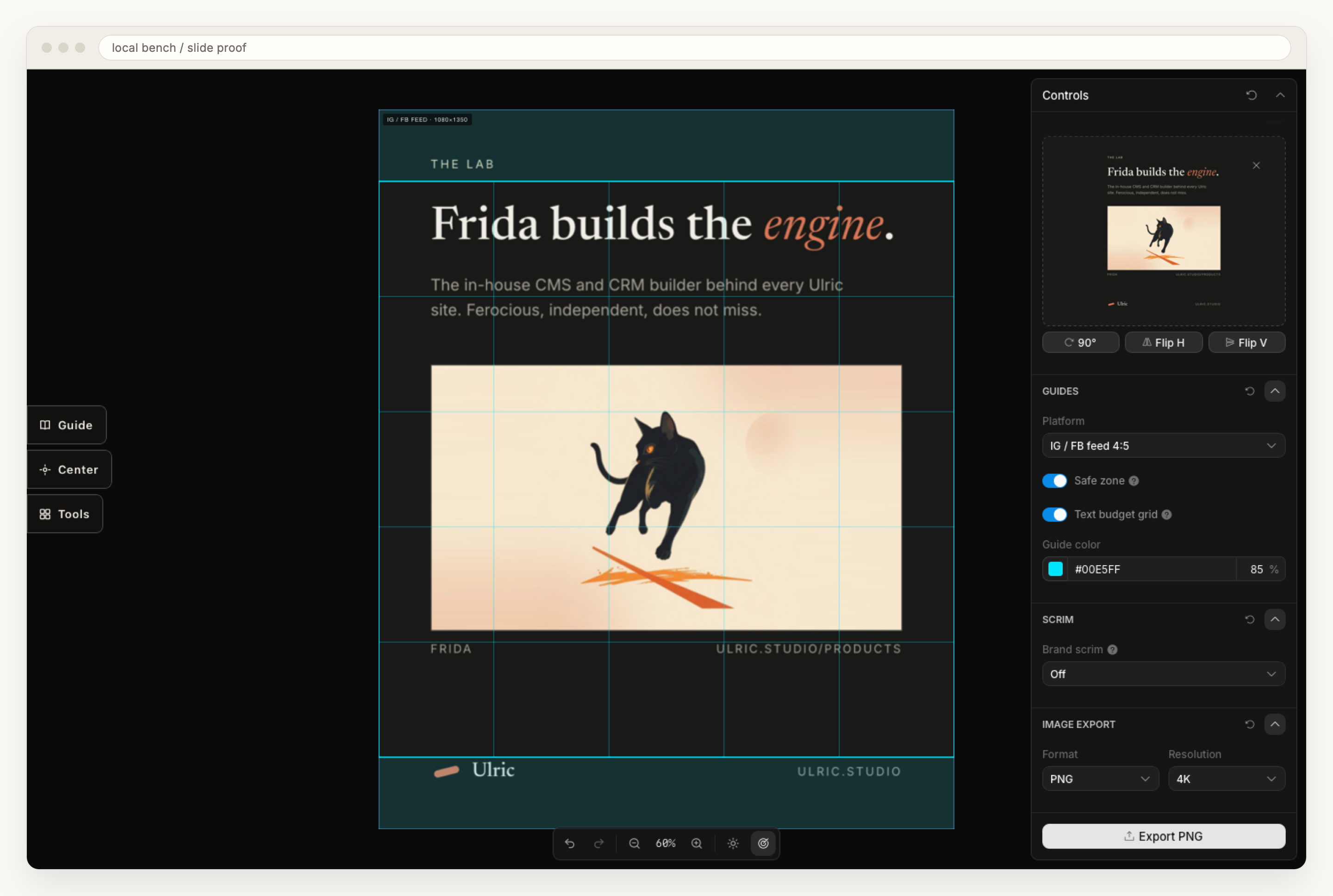
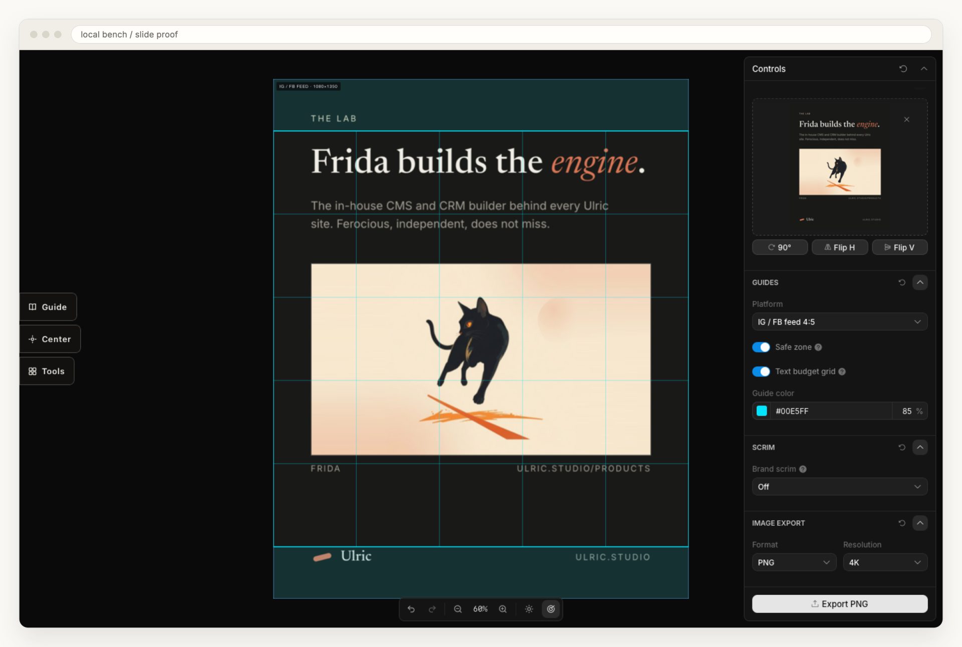
The five by five grid inside the square is a text budget rather than a platform rule. Twenty-five cells, and copy that stays inside five of them is inside twenty percent of the frame. It is a picture of a rule of thumb, which is a friendlier thing to design against than a percentage in a document.
What happened when I proofed a slide I had already posted?
It failed, and I only found out because I needed a screenshot for this post.
The slide in the screenshot above is one of my own, a 1080 by 1350 studio card that has already been published. I loaded it because it was the one image on the machine I could show without masking anything. Then I measured it, by scanning the PNG in Python for pixels that differ from the background and comparing the rows against the numbers the guide's own arithmetic returns.
The eyebrow at the top occupies rows 93 to 108. The safe square starts at row 135. The wordmark and the URL at the bottom occupy rows 1225 to 1254, and the safe square ends at row 1215. Both of them are entirely outside the area my own tool says copy has to stay inside, on a slide I designed, proofed by eye, and posted.
The interesting question is whether the guide is right, rather than whether I made a mistake laying the slide out, and answering that took me somewhere I did not expect.
Where do the constants in that file actually come from?
Me, on a day I did not write down.
Start with the story bands, because they are the ones that look most like published specification. Meta's help page on this subject is called "About text overlays and the safe zone for ads in Stories and Reels", and here is what it says about where the safe zone is:
For ads with a 9:16 aspect ratio in Stories, Reels, Feed and Facebook in-stream reels, keep the edges (top, bottom and sides) free of key creative elements, text and logos.
That is the whole geometry. No pixels, no percentages, and a pointer to a "Safe zone guardrail" toggle inside Ads Manager that draws the boundary for you on your own creative. The page carries exactly one measurement of its own: if an ad includes a disclaimer, leave the bottom 40 percent of a Reels ad clear. My file says 16 percent at the bottom. Against that single published figure, my constant is not conservative at all.
Google's photo guidance for a Business Profile is similarly specific about the things it cares about and silent about mine. It gives format (JPG or PNG), file size (between 10 KB and 5 MB), a recommended resolution of 720 by 720 and a minimum of 250 by 250. It says nothing about a margin, and nothing about how much of an image may be text. My four percent inset is a studio convention wearing a platform's name.
The twenty percent text budget has the clearest lineage and the weakest standing. It was a Facebook advertising rule, and it is not on Meta's current safe zone page in any form. I keep the grid because designing to it produces slides I like better, not because a platform is counting my pixels.
And the square. The comment in that branch reads "Feed crop previews square", which was true when I wrote it and describes a profile grid rather than the feed. Instagram has since changed the shape of that grid. I am deliberately not putting a number on the new shape here, because every source I can reach for it is a social media guide quoting another social media guide, and I could not find it stated on a page Instagram publishes. So the honest status of the guide that flagged my own slide is "unverified" rather than "wrong", which is the worse of the two, because a tool that is wrong gets fixed and a tool that is unverified keeps being believed.
Why does a scrub builder need its own tool?
Because the alternative is authoring a camera move in a 3D app, rendering it, and then guessing at an encode that a scroll position can seek through smoothly.
Scrubforge authors the move on a keyframe timeline over any model and exports it four ways: an MP4 in which every frame is a keyframe, a PNG sequence, the move as JSON, and a live three.js embed that scrubs from scroll position instead of playing. That last one is why the tool exists at all. The same sampler drives the preview, the export frames and the shipped embed, which is the slide proofer's rule again in a different room: one function, several renderers, no chance of drift.
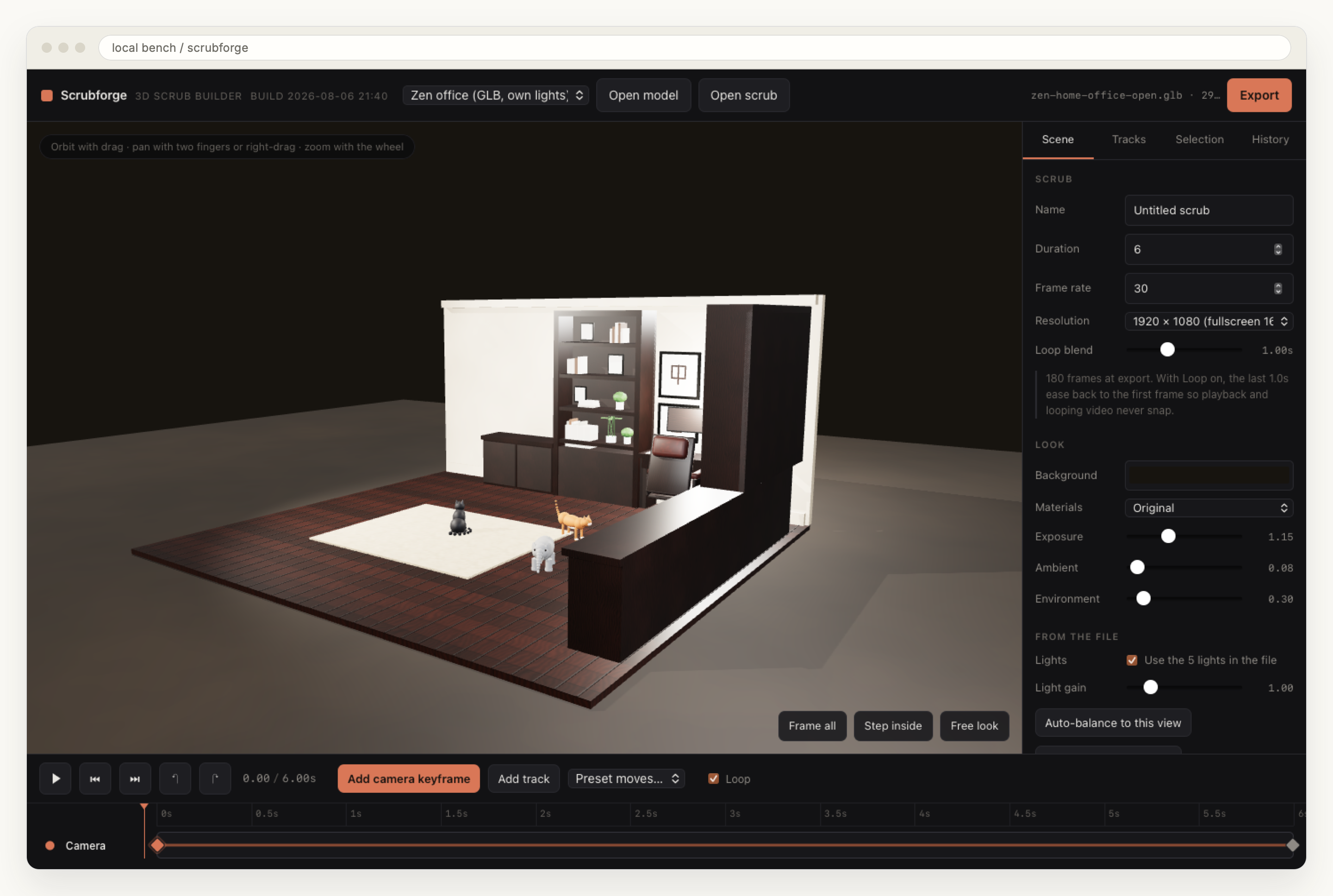
Two details from that screenshot are worth naming because they were both learned rather than designed. Ambient sits at 0.08 and environment at 0.30 whenever the file's own lights are in use, because otherwise those two form a brightness floor that no gain slider can get underneath. And the loop blend eases the last second of the move back onto the first frame across the whole state, camera and lights and object offsets together, so a looping film has no seam. The reason a model can arrive already lit at all is the Blender pipeline I wrote about in procedural geometry versus Blender over MCP.
Scrubforge is also the one tool on the bench that deliberately refuses the framework the others use. The other nine are built on an open source scaffold with a strict contract, which is excellent for a small panel of controls and openly hostile to a timeline. So this one is plain Vite and three.js: 2,592 lines of my own JavaScript, and 67 MB of dependencies against 334 MB each for the eight design apps, 369 for the proofer.
Why two recorders instead of a screen capture?
Because a screen capture is neither framed nor repeatable, and those are two different problems.
Screenframe solves the framing one. It takes a screen recording, sets it inside Mac browser chrome on a styled stage, and exports an MP4 that the browser composites and encodes itself through WebCodecs, with a server side ffmpeg path kept as an option. It carries the same architectural rule as the proofer, hard won after a cycle where the preview and the export quietly disagreed: one layout function, consumed by the DOM preview, the client encoder and the server compositor, so the frame on screen is the frame in the file.
The repeatability problem needs something smaller. A film of a live animated page is only comparable to the last film of it if time itself is under control, so the page reads its clock through a hook when one is present, and the recorder supplies it:
pg.add_init_script("window.__t = 0; window.__pwNow = () => window.__t;")
...
pg.evaluate(f"window.__t += {1000 / FPS}")
pg.evaluate("new Promise(r => requestAnimationFrame(() => requestAnimationFrame(r)))")
pg.screenshot(path=f"{OUT}/f{n:04d}.png")
Wall time stops mattering, and the frames come out identical on a busy machine and an idle one. That recorder is a hundred line script rather than an app, and how its output gets encoded for scrubbing is its own post about the scroll scrub stack.
The fifth thing on the bench is a headless WebKit crawl at 390 pixels wide that walks a site and asserts geometry rather than looking at it, and everything I know about why that number and that engine is in the post on designing for one thumb.
What does the bench cost to keep?
About 4.5 GB of disk and one gate I have not finished.
Measured with du -sk, which counts in 1024-byte blocks: the bench folder is 4,664,356 KB, and 3,183,108 KB of that is node_modules across ten tool folders. About two thirds of the bench is dependencies for tools nobody will ever install. That figure covers the folder alone. The frozen-clock recorder lives outside it and adds another 148 MB, of which 147 MB is stored footage and about 700 KB is the application itself.
The gate is more interesting than the disk. The scaffold that Slide Proof and the eight design apps share ships a protected delivery check, and the proofer's own build log records why it does not pass:
Risk: The Playwright browser scenarios for the declared acceptance rows are not yet written, so the protected delivery gate fails at browser evidence until that follow-up lands.
That is still true. I drove the tool through a real browser by hand, watched it take an upload, draw guides and export a 4096 pixel PNG, and then stopped, because the tool was already saving me the Friday arithmetic. It is the correct trade for something only I will ever run, and it is worth being precise about rather than implying the suite is green.
Neither of those is the real cost. The real cost is that a tool encoding somebody else's rule starts aging the moment it is written, silently, while continuing to give confident answers.
What generalizes from a bench nobody else will ever run?
Two rules, and the second one I only wrote down while writing this.
The first: the proof and the artifact must be produced by the same function. A preview that draws its own version of the guides is not a check, it is a second opinion, and the two will agree right up until the day they matter. Slide Proof, Screenframe and Scrubforge all landed on this independently, which is usually a sign the shape is right rather than clever.
The second: a constant borrowed from a platform needs a date and a source sitting next to it in the file, or the tool becomes folklore with a good interface. My scrim ramps have that property already, because they are copied verbatim out of client deck CSS and the file says so, which is also why the preset menu carries client names and stayed out of every screenshot here. My platform constants do not. There is no line in proof-spec.ts that says where four percent came from, or when 13 and 16 were last checked, or that the word "square" describes a layout Instagram has since changed.
So every constant in that file is getting two fields beside it, a source and the date it was last checked, and the guide will refuse to draw itself once a date has gone a year without being looked at. The square is the first line that would go dark.
Common questions
What is on the studio tool bench?
Ten browser apps in one local folder plus two recorders and a phone audit alongside them. The five that do the most work are a proofing bench for social slides, a 3D scrub builder, a recorder that frames screen captures in browser chrome, a second recorder that films a live page on a frozen clock, and a headless WebKit crawl that checks a site at 390 pixels wide. The other eight are a design lab, one effect each.
Why do the tools stay local instead of shipping as products?
Because none of the costs of a product buy me anything here. There is no account, no hosting, no support and no update to babysit, and nothing on the bench is ever touched by a client. A tool that takes an evening to build starts paying for itself the same week, and the only thing that leaves the machine is the finished file it produced.
How does the slide proofer know where a platform will crop?
It computes it. One function takes the format and the canvas dimensions and returns the safe area plus the bands the platform covers, so a 1080 by 1350 feed canvas yields a 1080 square with 135 pixel bands above and below, and a 1080 by 1920 story yields bands of 250 and 307 pixels. The same function feeds both the on-screen overlay and the exported PNG, so the proof and the artifact cannot disagree.
Does Meta publish pixel sizes for story and reel safe zones?
Not on its own help page. The article on text overlays and safe zones says to keep the top, bottom and side edges of a 9:16 ad free of text and logos, and points to a safe zone toggle inside Ads Manager rather than giving dimensions. The one measurement it does publish is that a Reels ad carrying a disclaimer should leave the bottom 40 percent clear. Any pixel figure tighter than that, including the ones in my own tool, is a studio convention rather than a platform rule.
Related